Instagram content is the hottest topic in agency land today – but how do you create a cut-through, engaging and memorable post or ad? This is the question that keeps creatives and clients up at night. But not anymore. In this blog, we provide the ultimate cheat sheet for creating the most engaging and effective content on Instagram using the latest scientific facts and its use in the world of social media.
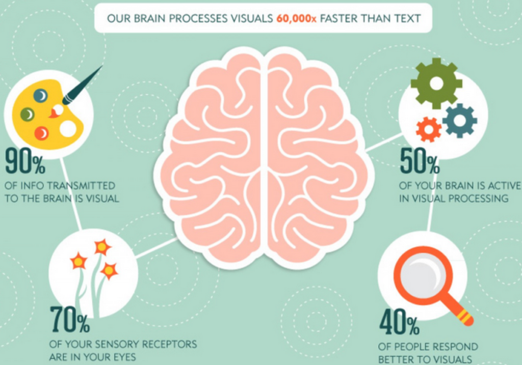
60.000 times faster than text
Instagram is a visual platform. It is all about visual experience and that is why it is gaining its popularity among users. One of the reasons is that our brain understands visual content 60.000x faster than text. A huge opportunity to communicate a brand’s values effectively. Don’t you think?
David Konigsberg, 2013
13 milliseconds
According to MIT research, people can understand the basic information (object, color, mood) from an image in 13 milliseconds. This is the time you are able to provide your audience the first impression and basic information (color, mood, style) about your brand. Keep this in mind when creating visuals and test it on your colleagues. If they won’t be able to get the main idea from the visual in less than a 13 milliseconds, you should improve it or give it another purpose.
2 seconds attention span
In 2016, research conducted by Facebook revealed that the attention span for one post on mobile devices is a little less than 2 seconds. You should extend this time by creating an appealing, cut-through and visually engaging post. The more time your audience spends on the content you create, the more appealing and memorable the brand is for the individual. This might not always be the case. If you are able to provide an information in less than 2 seconds by having simple visual information, you also win.
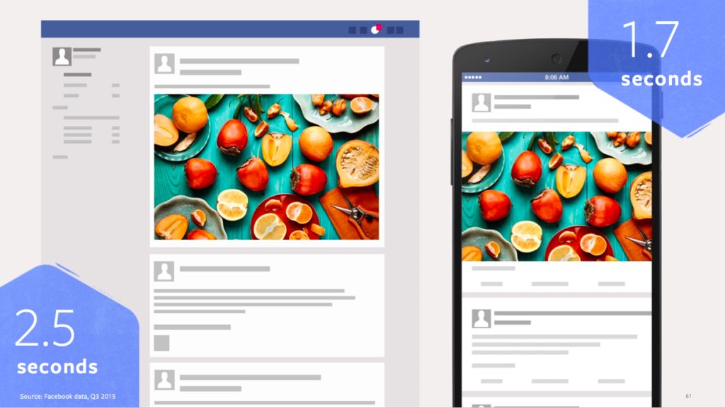
Facebook 2015
Our brains love simplicity
Our brains like simple ideas and pictures give marketers the possibility to reduce information to the really important ones. Consider road signs: is it better to have a sign that says “there is a school ahead? Watch out for children crossing the road” or to have an image of two schoolchildren walking?
This applies to color as well. Pictures containing 2 dominant colors are more likable by our brain than having an extravagant multicolored image.
Use this for Instagram content as well. It is always easier to read emotions (emotions sell is a well-known fact) and information from simple pictures.

Hoon Rhee, 2013
The tale of 2 chickens
Research from 2010 (was already well validated) conducted by the University of Texas proves that people decide not only based on emotions but also based on the visual attractiveness. The researchers asked a group of people which of 2 chickens they would like to have cooked for dinner.
The pretty chicken is super tasty, the most tender meat you have ever eaten. And the second ugly chicken is free range super healthy bio chicken. The vast majority of respondents choose the pretty chicken.
Then the researchers asked another group of people the same question. However, the characteristics of those chicks were switched. The pretty chicken was super healthy but not so tasty and the ugly chicken was super tasty but not so healthy.
The result was that the majority of respondents decided to eat the pretty chicken again. This simple experiment proves that people decide based on visual information (attraction).
Use this knowledge and create beautiful Instagram content to make users choose your product over the others.
Fit into the Instagram environment
People enjoy Instagram because of its visual beauty. They are following celebrities and their beautiful life, DIYs/crafts, art, travelers and other visually attractive activities and events from life (that many people can’t experience). The most important for brands is to fit into this environment and not act like an advertisement. People do not want to see ads on Instagram; they want to get visual satisfaction.
The trick for creating cut through content is not to over-photoshop, create graphics which looks like posters or ads or even use stock photos. 65% of Instagram users do not notice any ads. However, there is plenty of ads on Instagram and that is a good thing. Instagram is not a selling channel but it is brand awareness and brand building channel. Nonetheless, this is changing thanks to new Instagram conversion formats such as shopping tags.
Focus on the quality of the picture. If you do not have a visual feeling or you do not have video or photo production at your agency, you can try an alternative such as Canva or photo libraries like Unsplash or Lobster. Do not ever use stock images that are staged and do not feel natural to the Instagram environment.
Try to use user-generated content banks instead. It fits more into the Instagram environment. And this will be the last tip. Observe how your audience is taking photos of your products and do the same. Learn from your audience and copy the style they have.
An example of perfect posts
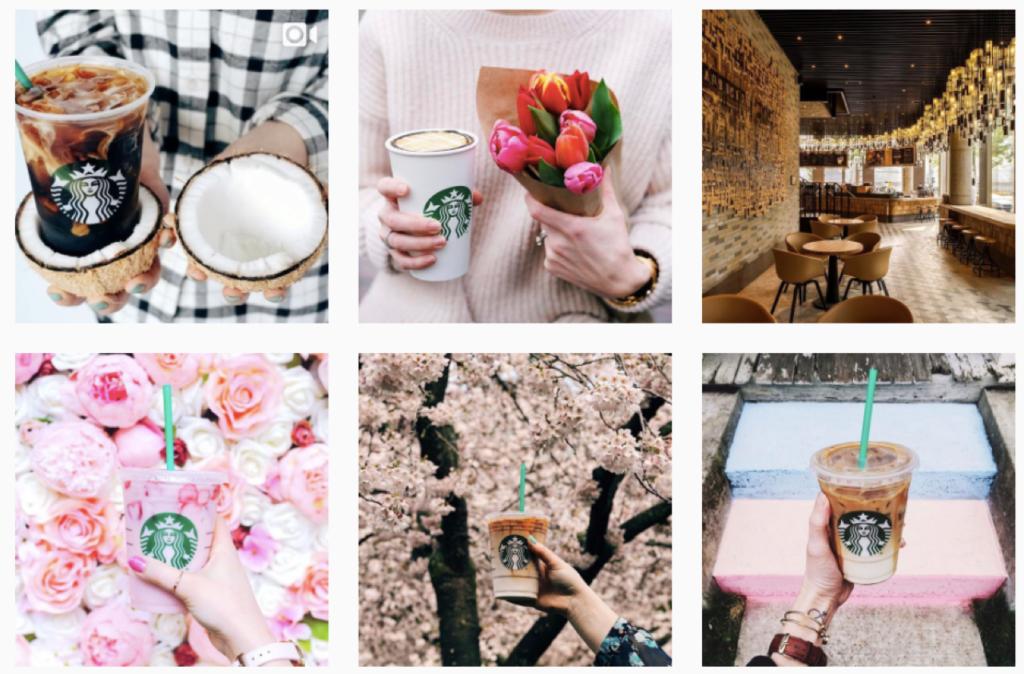
Starbucks Instagram profile
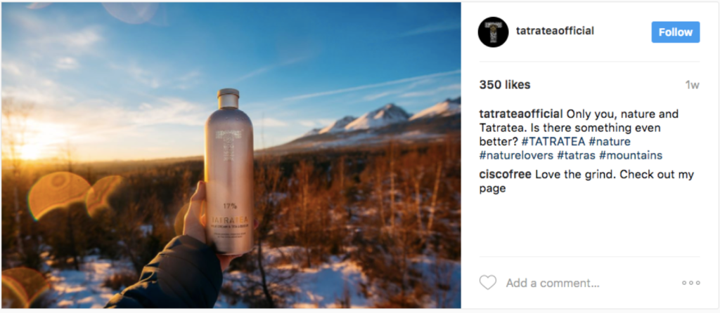
TatraTea Instagram posts
- Unlike Starbucks, Tatra Tea has not so visible logo but the branding is the whole photo (hiking and High Tatra mountains)
- Does not have any watermarks or logos in the image
- Simple photos with one or 2 dominant colors
- Looks like user-generated content
- Natural and authentic photos fitting beautifully into the Instagram environment
Examples of bad Instagram posts
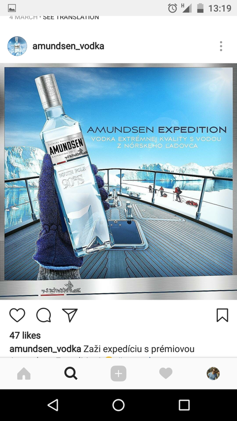
Amundsen Vodka Slovakia
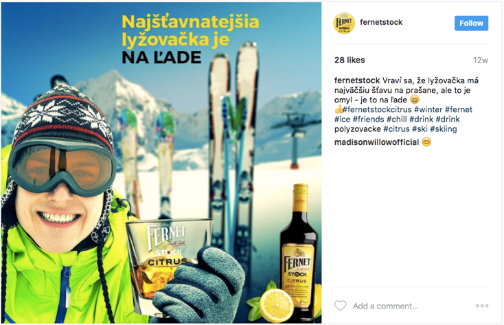
Fernet Stock Slovakia
- does look like billboard or pamphlet
- too many logos and brandings
- unnatural graphical post-production
- stock photos
- These kinds of posts will never be able to compete with other brands
Unfortunately, not everything could be mentioned in this blog. However, I hope you have enjoyed reading and that you will apply some of these tips and hacks to your brand’s Instagram profiles.